How to Design Your Teardrop Flag for Maximum Impact
Choosing the Right Font
Choosing the right font for your teardrop flag design is crucial for ensuring that your message is effectively communicated to your target audience. When selecting a font, it is important to consider the readability and visibility of the text, especially from a distance. Opt for a font that is clear, bold, and easy to read to ensure that your message is easily comprehensible to those passing by.
Moreover, the font you choose should also reflect the tone and personality of your brand. Whether you opt for a traditional, elegant font or a modern, bold typeface, make sure that it aligns with your brand's identity and values. Consistency is key when it comes to branding, so selecting a font that complements your existing branding materials will help reinforce brand recognition and create a cohesive visual identity across all your marketing materials.
Emphasising Legibility and Brand Consistency
Legibility and brand consistency are paramount when designing a teardrop flag for maximum impact. Choosing the right font is crucial to ensure that your message is clear and easy to read from a distance. Opt for a font that is simple, bold, and easily recognizable to maintain legibility. Avoid intricate or overly stylised fonts that may hinder readability, especially when the flag is fluttering in the wind. Consistency in font choice across all your branding materials will help reinforce your brand identity and make your message cohesive.
When designing your teardrop flag, consider how the font size and style complement your brand image. Ensure that the text is large enough to be seen clearly from a distance without overwhelming the overall design. Consistency in font size and style across your teardrop flag and other marketing materials will establish a strong brand identity and reinforce brand recognition. Remember that a well-designed flag will not only attract attention but also communicate your message effectively, so prioritise legibility and brand consistency in your design approach.
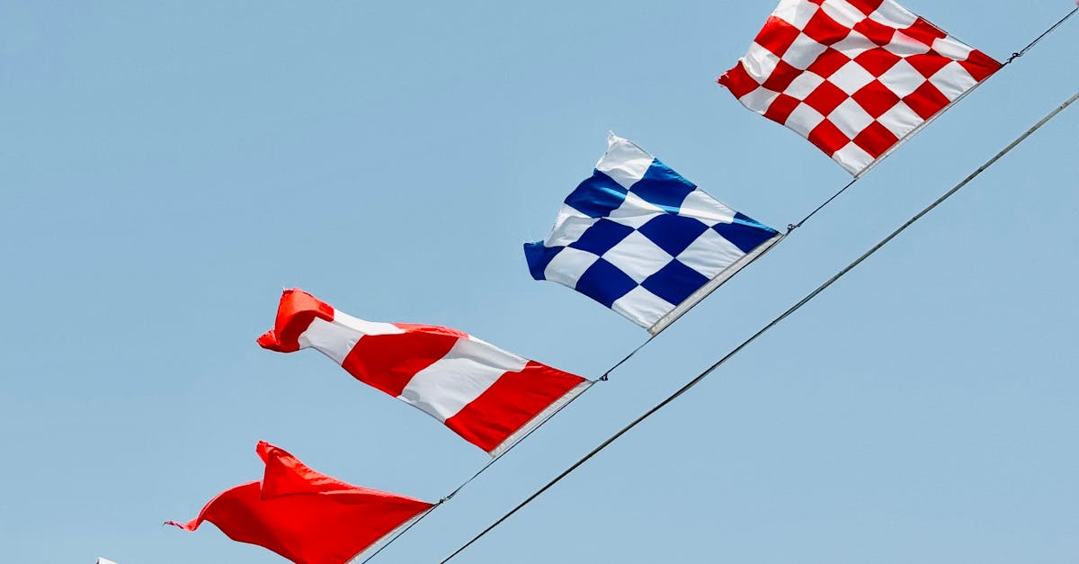
Consideration for Flag Size and Shape
When it comes to designing a teardrop flag for maximum impact, one key consideration is the flag's size and shape. The size of the flag should be proportional to the intended viewing distance and the surrounding environment. A flag that is too small may go unnoticed, while one that is too large could overwhelm the space and distract from the intended message. It is important to strike a balance and ensure that the flag is large enough to grab attention, yet not so large that it becomes obtrusive.
Additionally, the shape of the flag plays a significant role in its overall visual appeal. The teardrop shape is a popular choice for its striking and unique silhouette, which helps the flag stand out amongst other signage. When designing your teardrop flag, make sure to consider how the chosen shape will work with your overall design concept. Utilising the shape effectively can enhance the flag's aesthetic appeal and help draw in viewers' attention effectively.
Ensuring Design Fits Properly on Teardrop Flag
When designing a teardrop flag, it is crucial to ensure that the design fits properly on the flag itself. The proportions of the flag need to be considered carefully to avoid any distortion or loss of visual impact. The design should be created with the unique shape of the teardrop flag in mind, taking into account the curved top and narrow bottom of the flag.
To maximize the impact of your teardrop flag design, it is important to avoid overcrowding the space with too much text or imagery. Opt for a bold and simple design that is easily recognisable from a distance. By keeping the design clean and focused, you can create a striking visual that effectively communicates your message to onlookers.
Reflecting Brand Identity
Reflecting your brand identity through your teardrop flag design is crucial for creating a lasting impression on your target audience. Consistency with your brand guidelines is essential in conveying your brand message effectively. When designing your flag, ensure that the colours, logos, and overall aesthetic align with your brand’s visual identity to enhance brand recognition and trust.
Maintaining brand consistency across all marketing materials is key to establishing a strong and cohesive brand presence. By incorporating elements such as brand colours, fonts, and logos onto your teardrop flag, you can reinforce your brand identity and make your brand more memorable to consumers. Remember, a well-designed flag that reflects your brand identity not only attracts attention but also communicates professionalism and credibility.
Maintaining Consistency with Brand Guidelines
Maintaining consistency with brand guidelines is crucial when designing a teardrop flag for maximum impact. By adhering to the predetermined colour palette, typography, and logo usage outlined in the brand guidelines, you can ensure that your flag seamlessly integrates with your overall brand identity.
Consistency across all branding materials is key to establishing a strong and recognisable brand presence. When designing your teardrop flag, make sure to use the correct logo variations approved by your brand guidelines and maintain a consistent tone and style throughout. This will not only help reinforce brand recognition but also create a cohesive visual identity that resonates with your target audience.
FAQS
Why is choosing the right font important when designing a teardrop flag?
The font you choose plays a crucial role in the legibility and overall impact of your teardrop flag. It should be easily readable from a distance to ensure maximum visibility and effectiveness.
How can I emphasize legibility and brand consistency in my teardrop flag design?
To emphasize legibility, use a font size and style that is clear and easy to read. For brand consistency, ensure that the colours and design elements used in the flag align with your brand's identity and guidelines.
Why is consideration for flag size and shape important in teardrop flag design?
The size and shape of the flag will determine how well your design fits and how visible it is. It is essential to choose the right size and shape that complements your design and maximizes its impact.
How can I ensure that my design fits properly on a teardrop flag?
When creating your design, make sure to take into account the curvature and shape of the flag. Test your design on a template or mockup to ensure that it fits properly and looks great when displayed.
Why is reflecting brand identity important in teardrop flag design?
Reflecting your brand identity in the design of your teardrop flag helps to create a cohesive and consistent brand image. It also helps to build brand recognition and reinforce your brand message to your target audience.
Related Links
Why Teardrop Flags Are Effective for Outdoor AdvertisingHow to Choose the Right Size for Your Teardrop Flag
The Complete Guide to Teardrop Flags
A Review of Teardrop Flags: Pros and Cons
5 Design Options for Teardrop Flags
The Evolution of Teardrop Flags
Why Teardrop Flags Are a Versatile Marketing Tool